WAYNES COFFEE
Waynes is a a Swedish coffechain that introduced the American coffee-culture to Stockholm in 1994.
A lot have happened since then and for the first time in 25 years it was now time to update its identity.The brand identity needed to be strengthen and the Swedish heritage had to become stronger to prepare the brand for a bigger expansion abroad.
Waynes signature color blue have throughout the years been devalued so now a new, fresh and brighter Scandinavian blue was selected to take place both in it´s interior concept as well in it´s new Brand Identity. Together with bold graphics, playful hand drawn illustrations, inspiring photography, a new tactile material palett with a Scandinavian touch to it Waynes have created a new strong brand identity.
The new concept was created by a strong team:
Interior architect: Studio C
Collaboration with: Studio Peter Lundbergh
Visual identity: Vivi Sumpton Design, Studio Böttiger
Copy: Lotta Ekberg Copywriter
Illustrations: Alice Meteignier
Photography food: Susanna Blåvarg
Photography Interiors: Patrik Lindell


Detail of wall. Wally lamp from Santa Cole

Waynes Coffe won Gold for “Best visual identity from food and beverage sector”.

Fika Market for take-away


Detail of wallpanel

Moodboard with materials and colors


Material and color selection

Sketchbook
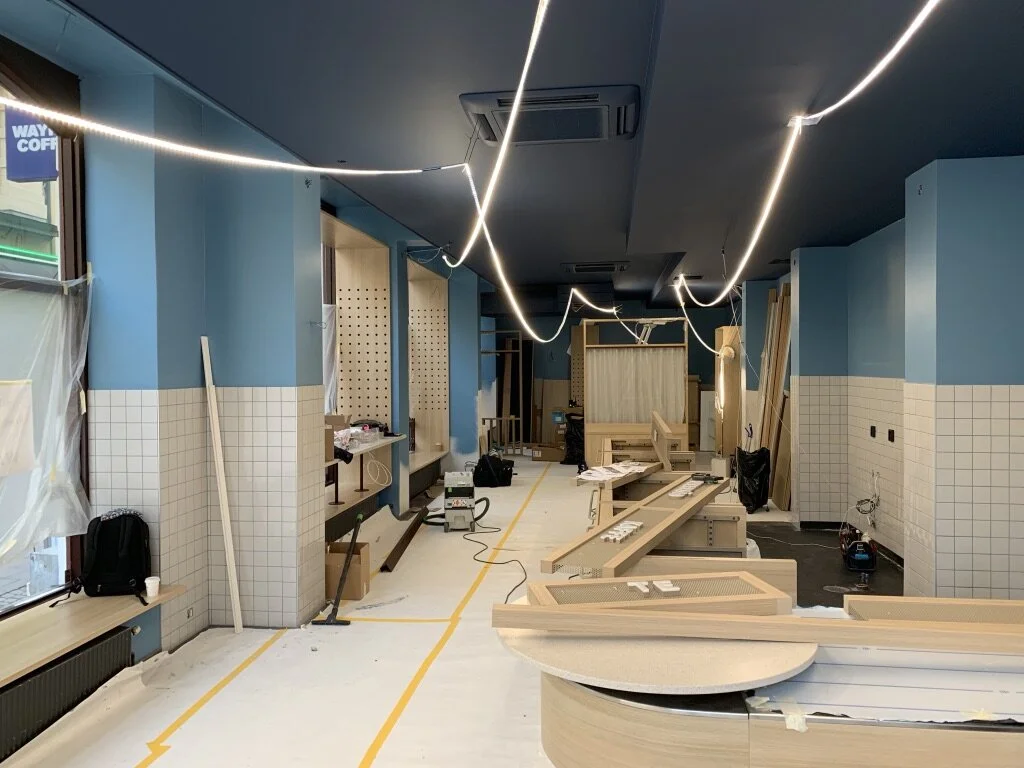
Before opening

Before

After – The space was transformed with a new fresh Scandinavian feel to it. Concept ready to be rolled out worldwide.